
- A vibe-coded look is observable UI drift, not proof that AI authored the page.
- Fix repeated decisions at the system level before polishing isolated screens.
- Rerun the same checks after the change so the evidence is comparable.
- Use the free AI route if you can implement, test, and judge the result yourself.
You know the moment. The route loads. The core flow works. Yet the interface still feels like several reasonable prompts landed on the same page without agreeing on the rules. One button is taller. A secondary state uses a new blue. Mobile spacing seems improvised. Nothing is obviously broken, but the client can feel the inconsistency.
This guide gives you a practical way to fix that problem without buying a full redesign or asking a model to “make it premium” again. Start with one route that matters to the next review. Record what is visibly different. Turn repeated decisions into shared rules. Apply those rules. Then rerun the same checks under the same conditions.
What is a vibe-coded website?
A vibe-coded website is an interface built quickly through AI-assisted prompts where individual outputs can look acceptable, but the complete route shows inconsistent type, color, spacing, controls, states, or responsive behavior.
The phrase describes the visible result and the build process. It does not prove that AI authored the page. A human team can create the same drift, and a carefully governed AI workflow can avoid much of it. The useful question is not “Did AI make this?” The useful question is “Which decisions do not share the same rule?”
That distinction matters because an AI detector promise would be both weak and unnecessary. You do not need to identify the author to see that a primary button has three heights, body copy uses conflicting line lengths, or an empty state follows a different visual language from the loaded state.
Public builder discussions describe the problem in plain language. One Claude user asked how to maintain consistency “without having to prompt Claude on every little detail.” That is the operational problem: every unrecorded decision has to be remembered and requested again.
Why does the interface drift after more changes?
The interface drifts because each new prompt can solve the local request without inheriting the exact visual rules, component states, responsive boundaries, and acceptance checks that governed the previous screen.
The first pass often feels fast because there is little history to preserve. By the fifth or tenth change, the system has accumulated local exceptions. A builder in a public vibe-coding discussion put it directly: “The 5th or 10th change is where things start to go downhill.”
The model may not know that the 44-pixel control height is intentional, that muted copy has one approved contrast level, or that the tablet breakpoint needs the same stacked order as mobile. If those rules live only in your memory or the previous chat, the next change is free to redraw them.
This is why more prompting can make the route worse even when every prompt sounds reasonable. The work is being optimized one request at a time. The product needs rules that survive the requests.
What should you check before client review?
Before client review, inspect six categories on one complete route: type roles, color tokens, spacing rhythm, repeated controls, the mobile boundary, and named accessibility signals.
Do not begin by changing code. Capture the rendered route at a declared desktop width and a declared mobile width. Then record observable differences in a table. A finding should be specific enough that another person can see the same thing without reading your mind.
| Check | What to inspect | Useful evidence |
|---|---|---|
| Type roles | Heading levels, body size, line height, labels, and helper text. | Two elements serving the same role but using different values. |
| Color tokens | Actions, text, borders, surfaces, error states, and success states. | A raw color that falls outside the declared palette or changes meaning. |
| Spacing rhythm | Section gaps, control padding, form groups, and repeated content blocks. | A repeated pattern with one unexplained gap outside the scale. |
| Repeated controls | Buttons, inputs, links, focus states, disabled states, and errors. | The same control changing shape, height, label behavior, or state treatment. |
| Mobile boundary | Overflow, stacking order, tap targets, sticky elements, and readable line length. | Content lost or forced into two-directional page scrolling. |
| Named accessibility signals | Contrast, focus visibility, labels, keyboard reach, semantics, and reflow. | A named automated result plus manual review of the rendered state. |
The mobile check needs a real boundary, not “looks fine on my phone.” The W3C Reflow guidance says non-excepted content should be available “without loss of information or functionality” and without two-dimensional scrolling at a width equivalent to 320 CSS pixels. That does not turn this checklist into an accessibility audit. It gives you one named condition to test.
For each finding, write the location, expected rule, observed difference, viewport, and evidence file. Avoid taste-only notes such as “feels cheap.” Replace them with something testable, such as “The primary action is 44 pixels tall in the header and 52 pixels tall in the form with no documented variant.”
Can Claude or ChatGPT fix a vibe-coded UI?
Yes, Claude or ChatGPT can help fix a vibe-coded UI if you provide the rendered evidence, define the rules, constrain the scope, inspect the implementation, and rerun the checks yourself.
The honest free route is strong. Use it before paying anyone if you are comfortable making product-design decisions and reviewing code. The model can compare screenshots, inspect a repository you control, propose tokens, refactor repeated styles, and write tests. The missing layer is accountable judgment: choosing the right rule, deciding what is in scope, validating the rendered result, and rejecting a technically clean change that still fails the client-review goal.
- Give it one route.Do not ask for a full-app cleanup. Provide one buyer-authorized public URL and the two viewport conditions. Do not send source code or private access.
- Provide evidence, not adjectives.List the six check categories, attach screenshots, and describe each inconsistency in observable terms.
- Ask for the rule before the patch.Have the model propose a named token or component-state rule and show where that rule will apply.
- Constrain the change.Tell it which route, components, files, and behaviors must remain untouched.
- Review the rendered route.Do not accept a build result as visual proof. Inspect desktop, mobile, focus, error, empty, and loading states.
- Rerun the same checks.Use the same viewport, data state, and baseline so the before and after are comparable.
Visual comparisons can help. Playwright documents a workflow where the first run creates a reference screenshot and later runs compare against it. It also warns that rendering varies by operating system, version, settings, hardware, and other factors, so consistency requires the same environment. Chromatic's official guide makes a related distinction: functional tests can pass while visible appearance is still wrong, so snapshots and human review serve a different job.
A screenshot difference is not automatically a defect. It is evidence that something changed. A human still decides whether the change is intended, acceptable, and consistent with the product.
How do you fix UI drift without redesigning the whole app?
Fix UI drift without a full redesign by choosing one high-stakes route, recording the inconsistencies, converting repeated decisions into shared rules, applying those rules, and rerunning the same checks.
The goal is not to invent a new visual identity. It is to make the existing product behave like one product. Preserve what already works. Change only the values, components, and states that violate the declared system.
-
Choose one client-review route
Pick the route a buyer or stakeholder will actually see next. Include its loading, empty, error, and success states if they are reachable without private data.
-
Record each observable inconsistency
Capture desktop and mobile evidence. For each item, record the location, current value, expected rule, state, and why the difference matters to consistency or usability.
-
Convert repeated decisions into named rules
Create a small set of tokens and component-state rules. Use role names such as action-primary or text-muted, not raw values such as blue-500 that hide the decision.
-
Apply the system to the route
Replace local exceptions with shared tokens or components. Keep the patch bounded. Do not mix backend repair, feature work, or a full visual redesign into the same change.
-
Rerun the same named checks
Use the same route, viewport, fixture state, and environment. Save the results beside the original evidence. Record what moved and what remains out of scope.
This order prevents a common mistake: polishing the most visible screen while the shared component remains wrong. If three buttons drift because they bypass the same component rule, fix the shared rule and then verify all three instances. Do not hand-tune each button unless they are intentionally different variants.
What does an agent-ready UI system need?
An agent-ready UI system needs named tokens, explicit component states, declared responsive behavior, scoped instructions, and rerunnable checks that another agent or human can use without reconstructing the original conversation.
A style guide can describe the look. An agent-ready system also explains how the code should behave and what must be verified after a change. The point is not to create a large design-system project. The point is to preserve the few decisions that prevent this route from drifting again.
Type roles, colors, spacing, radii, borders, and motion values that explain their job.
Default, hover, focus, active, disabled, loading, error, empty, and success behavior where relevant.
Declared stacking, overflow, touch target, and content-priority decisions at named boundaries.
Files to use, patterns to preserve, prohibited local exceptions, and conditions that require human review.
Build, screenshot, UI-drift, and limited accessibility checks with disclosed conditions.
The route, fixture, system version, environment, results, and known exclusions captured together.
The receipt is not a universal quality certificate. It is a compact answer to five practical questions: What route was checked? Which system version was applied? Under what conditions did it run? Which named checks passed or failed? What was not tested?
What did the synthetic proof fixture actually prove?
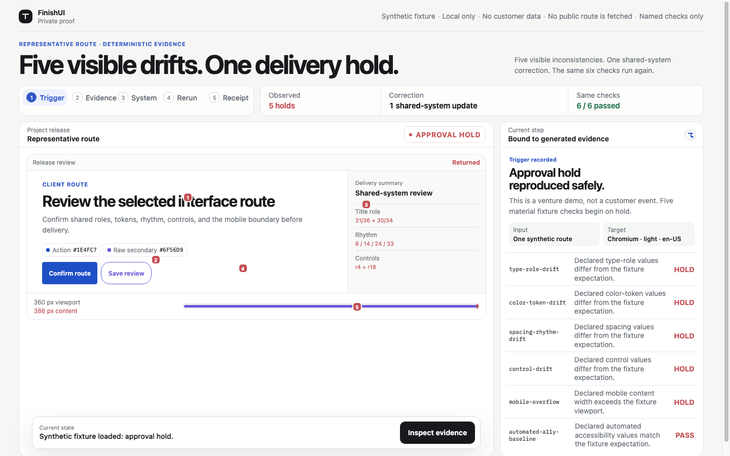
The synthetic fixture proved that five recorded UI holds could be corrected through one shared-system update and that six named record checks then passed under the fixture's disclosed conditions.
Before the correction, the fixture recorded visible drift across its covered route. Delivery stayed on hold. The implementation then replaced the shared-system values and reran the same named record checks. The result was six of six passing records.
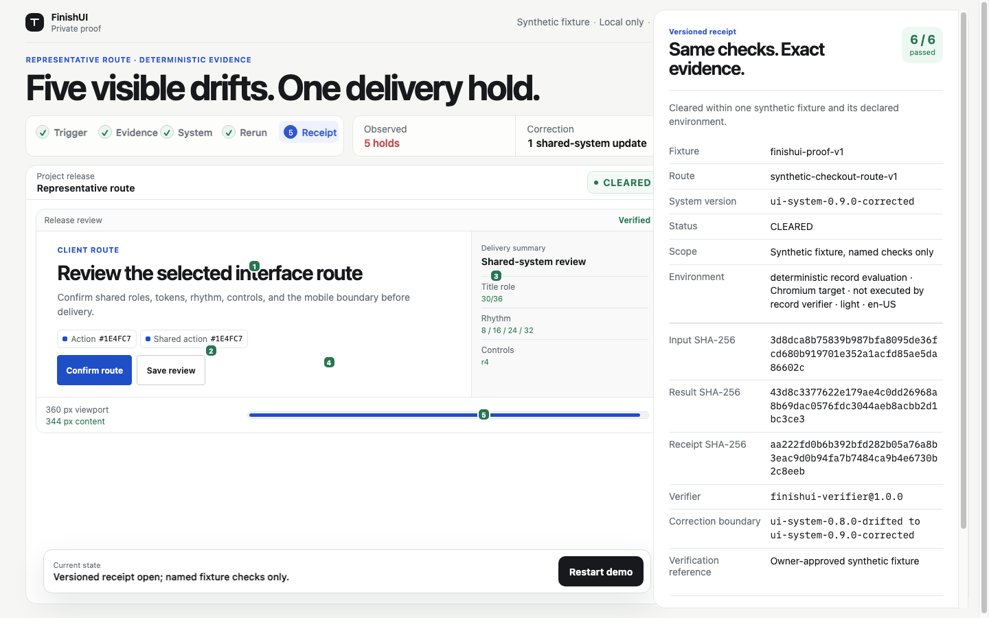
The record verifier did not execute Chromium. The fixture does not prove accessibility conformance, security, production readiness, client approval, conversion impact, or permanent prevention of future drift. It is not a customer result.
This boundary is part of good verification. A check should say what it observed, not borrow credibility from a broader test that never ran. You can inspect the local proof route and receipt before deciding whether the evidence is useful.
When does applied UI cleanup fit?
Applied UI cleanup fits when the product already works, several important screens visibly drift, and you want the correction implemented, checked, and documented instead of receiving another checklist.
Use Claude or ChatGPT yourself if you have the time, design judgment, code access, and testing discipline to complete the method above. The paid offer has to earn its place beside that free route.
A credible paid scope should define the accepted screens, supported framework, frozen visual checklist, delivery window, source-handling boundary, named checks, evidence returned, and correction window before payment. FinishUI does not ask for source code during the free scan.
It does not include a full-app redesign, backend work, database changes, authentication, payments, security review, compliance review, new features, additional routes, unlimited revisions, accessibility certification, or a promise that future unsupported edits can never drift.
Common questions before you use the method
The method is deliberately narrow: it identifies and corrects covered interface drift on one route, while keeping authorship, security, certification, and future-proofing claims out of scope.
Is this an AI detector?
No. The process identifies visible and structural UI inconsistencies. It cannot prove who or what created a page.
Will a shared UI system prevent every future inconsistency?
No. Named rules and rerunnable checks make covered drift easier to catch. New frameworks, features, and unsupported changes can introduce new issues.
Do you need a private repository for the free scan?
No. The free scan accepts one buyer-authorized public URL. Do not submit code, repository access, credentials, secrets, customer data, or confidential files.
Is this an accessibility audit or certification?
No. Named automated signals and manual readability review are limited checks. They are not certification or a comprehensive accessibility opinion.
Does the method work with Lovable, Replit, Cursor, or Claude?
The method is tool-independent because it inspects the rendered route and the rules behind it. Implementation details still depend on the framework and codebase.
How was this guide researched and reviewed?
FinishUI built this guide from direct inspection of a labeled synthetic UI fixture, primary technical documentation, and public community conversations used only for anecdotal language.
Who: FinishUI Research Desk prepared the guide and FinishUI is responsible for its final claims and boundaries.
How: AI assisted with research organization and drafting. The workflow then checked the cited sources, separated synthetic evidence from customer evidence, and edited every recommendation into an observable step.
Why: The page exists to help a builder diagnose and repair UI drift before a client review, even if they never buy FinishUI.
Sources and evidence boundaries
This guide uses official testing and accessibility documentation for the technical method, public forum threads only as anecdotal buyer language, and a clearly labeled synthetic fixture for the product proof.
The bottom line
Map the rules. Rerun the route.
The fastest useful first step is not another redesign prompt. It is a precise list of what drifted on one route and which shared rule should replace the local exception.
Request my free UI scan